Advanced Typography - Exercises

14/04/20 - 12/05/20 (Week 1 - Week 5)
Ehtasham Khan (0337420)
Advanced Typography
Exercises
____________________________________________________________
LECTURE NOTES
Lecture 1: Briefing (Week 1 - 14/04/20)
In the first video lecture, Mr. Vinod briefed us about the module and the course outline. Mr. Vinod told us that in this semester we will do the research on the given topic and will conduct the lecture every week. Mr. Vinod explained us about "Typographic Systems".
Typographic Systems
There are total of 8 typographic systems. These systems are intended to serve as a framework for organising a composition form in a manner that is functional and visually attractive.
Typographic Systems
There are total of 8 typographic systems. These systems are intended to serve as a framework for organising a composition form in a manner that is functional and visually attractive.
- Axial - Elements are organised either to the left or right of a single axis.
- Radial - Elements are organised to extend from a central point of focus like rays
- Dilatational - Elements are set along circular paths
- Random - Elements that are arranged without definite
- Grid - Arrangement of text and image on a page or screen. It is formed primarily of vertical and horizontal guides that create columns for text and images.
- Modular - It acts as a ground /shape to hold and contain text.
- Transitional - Informal system of layered lines of text into informal textured planes and shifted tonal banding.
- Bilateral - All text is symmetrically arranged on a single axis.
Lecture 2: Typographic Composition (Week 2 - 21/04/20)
There are different principles of typographic composition.
- Rule of Third - It suggest that a frame can be divided into 3 columns and 3 rows. The intersecting lines are are used as guide to place the points of interest, within the given space.
- Typographic Systems - There are total of 8 typographic systems which we have already studied in the previous lecture.
- Environmental Grid - This system is based on the exploration of an existing structure or numerous structures combined.
- Form & Movement - This system is based on the exploration of an existing Grid Systems.
Lecture 3: Typographic Perception & Organisation (Week 3 - 28/04/20)
Third Lecture
____________________________________________________________
INSTRUCTIONS
____________________________________________________________
EXERCISES
Exercise 1: Typographic Systems
Indesign (Week 1 - 14/04/20)
The first exercise was to design 2 layouts for each of the 8 typographic systems. We were asked to the project in Adobe In-design and the size of the artboard should be 200mm x 200mm. We were allowed to use minimal non-objective elements and one color. Below is the content we were supposed to use in the design.
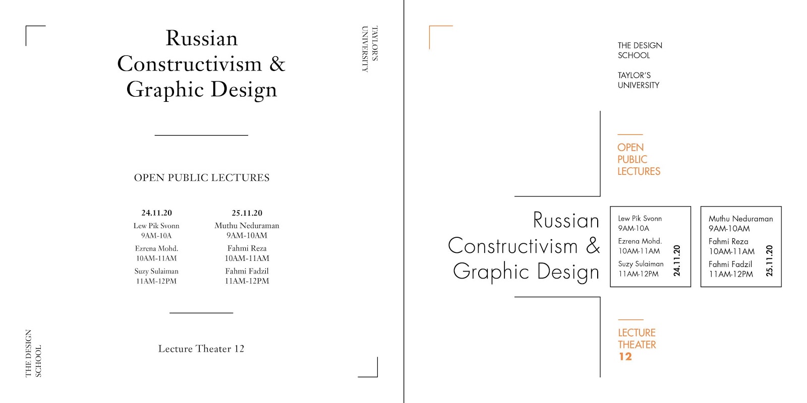
The Design School, Taylor’s University
All Ripped Up: Punk Influences on Design
or
The ABCs of Bauhaus Design Theoryor
Russian Constructivism and Graphic Design
Open Public Lectures: November 24, 2020
Lew Pik Svonn, 9AM-10AM Ezrena Mohd., 10AM-11AM Suzy Sulaiman, 11AM-12PM
November 25, 2020
Muthu Neduraman, 9AM-10AM Fahmi Reza, 10AM-11AM Fahmi Fadzil, 11AM-12PM
Lecture Theatre 12
The title I chose is Russian Constructivism and Graphic Design. I studied the article about Russian Constructivism by Mr. Vinod and designed the 8 typographic systems on indesign.
 |
| Fig 1.1: Process |
 |
| Fig 1.2: Process |
 |
| Fig 1.3: Process |
 |
| Fig 1.4: Process |
 |
| Fig 1.5: Axial System |
 |
| Fig 1.6: Radial System |
 |
| Fig 1.7: Dilatational System |
 |
| Fig 1.8: Random System |
 |
| Fig 1.9: Grid System |
 |
| Fig 1.10: Transitional System |
 |
| Fig 1.11: Modular System |
 |
| Fig 1.12: Bilateral System |
Update (Week 2 - 21/04/20)
I showed my work to Mr. Vinod and he gave me feedback and asked me to completely change Random as it was not random enough. He also gave me feedback on other designs and asked me to do some changes. I reworked on my designs in week 2, the following are the designs.
 |
| Fig 1.13: Process (Grids) |
 |
| Fig 1.14: Process (Grids) |
 |
| Fig 1.15: Axial System |
 |
| Fig 1.16: Radial System |
 |
| Fig 1.17: Dilatational System |
 |
| Fig 1.18: Random System |
 |
| Fig 1.19: Grid System |
 |
| Fig 1.20: Transitional System |
 |
| Fig 1.21: Modular System |
 |
| Fig 1.22: Bilateral System |
Exercise 2: Type & Play
Finding Type (Week 2 - 21/04/20)
In this exercise, we were supposed to find and extract at least 5 letters from any image between man-made objects (chair, glass, etc.) or structures (buildings), and nature (Human, landscape, leaf, plant, bush, clouds, hill, river, etc)..
We were asked to analyse, dissect and identify potential letterforms within the image. I selected an image of image of a tree with lot of branches and converted it to black and white.
 |
| Fig 1.23: Image |
 |
| Fig 1.24: Tracing H |
 |
| Fig 1.25: Tracing E |
 |
| Fig 1.26: Tracing A |
 |
| Fig 1.27: Tracing Y |
 |
| Fig 1.28: Tracing U |
After extracting the 5 letters, I began to refine them. I used Futura as a reference at first for the type.
 |
| Fig 1.29: Arranging Letters |
For refining the letters, Firstly I analysed and dissected the Futura letters. I could see the contrast in my type so I wanted to highlight that. I came up with the following result.
 |
| Fig 1.30: Refining |
There was the element of contrast in my letters, so I wanted to analyse a typeface which had contrast. I used Didot as reference.
 |
| Fig 1.31: Refining |
 |
| Fig 1.32: Comparison |
 |
| Fig 1.33: Final Result |
Type & Play(Week 3 - 28/04/20)
We were briefed about the second part of the exercise which is type and play. For this exercise we should use any image (a man-made structure or object, and nature) and combine text. Basically the goal is to create a relationship between the text and the image.
 |
| Fig 1.34: Image from Unsplash |
 |
| Fig 1.35: First Attempt |
 |
| Fig 1.36: 2nd Attempt |
 |
| Fig 1.37: Third Attempt |
 |
| Fig 1.38: Final Design |
____________________________________________________________
FEEDBACK
Week 2 (21/04/20)
General Feedback:
For Typographic Systems non-objective elements used should be minimal. In grid system align type to rows and columns. Have to update our blog regularly. For the final submission, post spreads as jpeg not screenshot. And embed the pdf with public access.
Specific Feedback:
In typographic system assignment, I used the time in the sentence. Mr. Vinod told me that we should downsize capital letters and numbers in a sentence. The specific feedback, which Mr. Vinod and Mr. Shamsul gave to me for typographic systems is as follows.
- Axial System - One is good but the other one is little empty and not that creative.
- Dilatational - In the first design, the separation is not necessary, it doesn’t have to be equal from top and bottom. Second is good to go.
- Random - Have to redo it as it's not random enough and not showing any chaos.
- Grid - The first design is simple & not that creative. Second is okay but shouldn't have black background.
- Transitional - The second design shouldn't have separation as it does looks nice.
- Modular - For the first design middle alignment is not working. Second is fine.
- Bileteral - Both design looks almost same, have to do something different.
Week 3
General Feedback:
Final typeface should have the crucial element of the source image.
Specific Feedback:
For the first part of my 2nd assignment, Mr. Vinod told me that my typeface looked good. He asked me try adding the small leaves in to the branches and see how it looks.
Week 4
General Feedback:
We need to ensure that the textual matter mimics the nature of the surroundings of the image we have chosen.
Specific Feedback:
For the type and play exercise, Mr. Vinod told me that my text was not mimicing the nature of the surrounding properly. I tried to show the movement by adding glitch but Mr. Vinod asked me that it's not showing that properly and I should change it. He also asked me to look at some other work. And then in the blog he highlighted "can you change the title of your blog to > Ehtasham Khan (0337420). Please update your feedback in the Google Sheet. All this goes toward your mark in eportfolio. These are easy marks to earn!"
____________________________________________________________
REFLECTION
Week 1 (14/04/20)
My experience in the first online lecture was really good as I was more comfortable in asking questions and could understand more easily. I was clear about the module outline and the lecture regarding typographic system.
I observed that I would learn a lot of new design concepts in this module but I have to work hard to fully understand the concepts and to keep up with the lectures and my exercises.
I found out that it's easier to ask questions online by typing out your issues.
Week 2 (21/04/20)
My experience for the second lecture was great. My work was updated so i was not worried. I got my feedback and Mr. Vinod asked me to do some changes. Though getting feedback face to face is easier as showing your work to the whole class is difficult.
I observed that I could give some extra hours to my work to polish my design.
I found out that it's difficult to show your work to whole lot of people.
Week 3 (28/04/20)
My experience for the third lecture was really amazing as my group gave the presented the lecture. Though I was little bit of scared when my part came but I studied and was clear about our topic so i did okay. Secondly, for the exercise I was happy with the outcome of my work and Mr. Vinod liked my work.
I observed that one feel really better if he is happy with the outcome of his work.
I found out that if you are clear about the concept before presenting your topic, you feel more confident.
Week 4 (05/05/20)
My experience for the fourth lecture was quite difficult at first since our class was on Microsoft Teams and I am not quite well versed with that software. There was also some interruption at the beginning of the class.
I observed that if the internet is not up to par, the experience of the class doesn't turn out so well.
I found that updating constantly about the feedback on Google Sheets adds up to the marks of the eportfolio.
____________________________________________________________
FURTHER READINGS
____________________________________________________________


Comments
Post a Comment